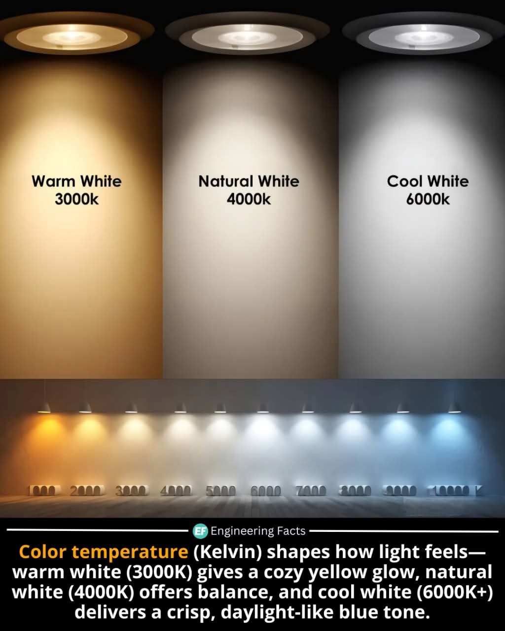
Lighting temperature isn’t just about brightness—it’s about mood, comfort, and even productivity. Warm white light (2700K–3000K) mimics the cozy glow of early evening, making it perfect for bedrooms and living rooms. Natural white (around 4000K) strikes a neutral tone ideal for kitchens, offices, and bathrooms where balance is key. Cool white (5000K–6500K) is crisp and energizing, often used in commercial settings or places needing focused attention, like hospitals and garages.
Higher Kelvin values mean cooler (bluer) light, while lower values lean toward warm (yellow/orange) hues. Choosing the right color temperature can improve sleep, reduce eye strain, and even affect your mood. It's not just about seeing better—it's about living better.
#LightingDesign #ColorTemperature #KelvinScale #InteriorDesignTips #WarmWhiteLighting temperature isn’t just about brightness—it’s about mood, comfort, and even productivity. Warm white light (2700K–3000K) mimics the cozy glow of early evening, making it perfect for bedrooms and living rooms. Natural white (around 4000K) strikes a neutral tone ideal for kitchens, offices, and bathrooms where balance is key. Cool white (5000K–6500K) is crisp and energizing, often used in commercial settings or places needing focused attention, like hospitals and garages.
Higher Kelvin values mean cooler (bluer) light, while lower values lean toward warm (yellow/orange) hues. Choosing the right color temperature can improve sleep, reduce eye strain, and even affect your mood. It's not just about seeing better—it's about living better.
#LightingDesign #ColorTemperature #KelvinScale #InteriorDesignTips #WarmWhite